Get (Un)Comfortable: Systemic Racism in Design
A workbook for white designers
2021
Racism has been upheld in every facet of our lives — whether we’re aware of it or not. The design world is no exception. It is historically and overwhelmingly white. As designers, the work that we put out into the world directly impacts society and we sometimes don’t realize how much power and influence we actually have. This workbook prompts white designers to learn the basics of how systemic racism affects the field, complete research, reflect on their own privilege, and advocate for better inclusion in the field. While this isn’t an exhaustive look into the system, it helps shift our way of thinking so that we can genuinely become better allies for our BIPOC (Black, Indigenous, and People of Color) counterparts and take the first steps in dismantling systemic racism.
Get comfortable with being uncomfortable.

How can I utilize my sphere of influence to discuss racism in design?
The opportunity
Systemic racism in and of itself is such a big topic to cover — especially during my last semester of college. And sadly, it can’t be solved overnight. So, I decided to utilize the opportunity that my senior BFA Exhibition provided, and the audience that will be seeing this project: white design professionals and students.
I chose to go forward with a workbook due to the level of engagement and interaction that it offers. This analog solution offers a break from the hours that designers spend on screens, as well as a less saturated and more private space away from the internet where activism has become performative in many cases. I started by brainstorming topics that I wanted my peers and future colleagues to know, then I organized them into possible sections. Narrowing it down to these main topics helped prioritize the content of my writing and research.
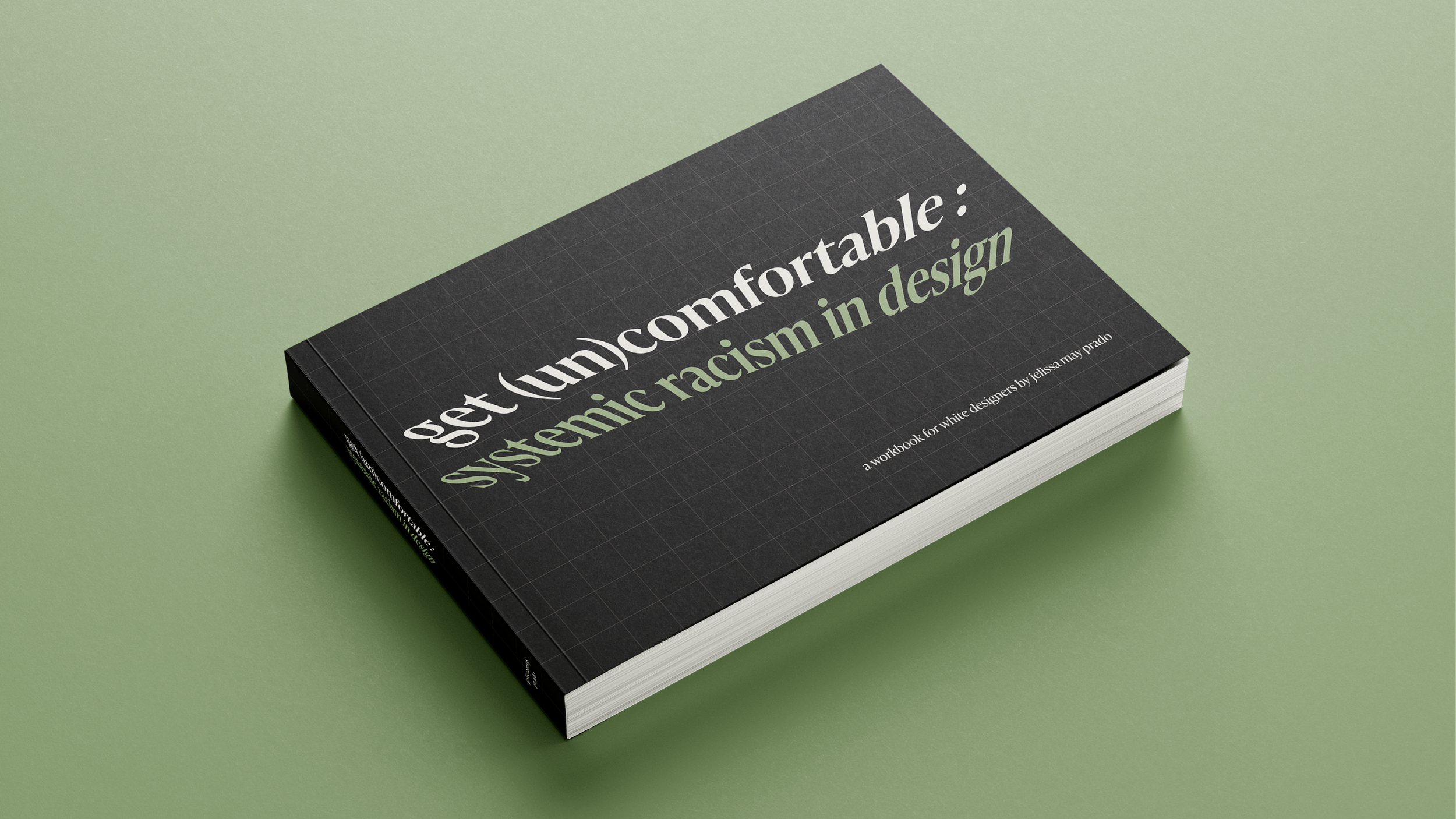
Making designers uncomfortable
Racism can be an uncomfortable topic for white people to discuss, and I decided to play on that idea of comfortability. Genuine change and growth stems from “getting comfortable with being uncomfortable.” The visual design was created with the intent to further push that feeling.
The type is warped — one of the most important rules we’re taught in typography is to never stretch a font. It’s placed against a grid to further emphasize that distortion. The dimensions are 8.5" × 5.5" so that it sticks out on a bookshelf and doesn’t go unnoticed. I’ve utilized visual cues that designers have a tendency to notice and desire to fix, thereby drawing in the attention of my target user.
You can read through my process book below to get a more in-depth view.
The solution
Asset
A workbook that presents information, along with reflection and research prompts to help white designers become better allies for past, present and future BIPOC in the design field.
8.5" × 5.5"
100 pages
Audience
White design students, teachers and professionals
Goals
Address the issue of systemic racism in relation to design
Provide a space for white designers to learn, reflect and research
Inspire white designers to continue this work and become better allies
Utilize my sphere of influence and reach as a senior design student
