Supporting Filson’s D&I Initiative
Brand identity and strategy
2020
Like many companies in the US, Filson has a diverse group of employees in their warehouse. However, that diversity is not reflected within leadership positions, upper management, or advertisements for their products. My goal was to investigate this issue and help Filson become more inclusive.
I learned that during the summer of 2020, Filson created a Diversity & Inclusion Initiative for any employee to become a part of and be heard within the company. However, this was only sent out through an email — not everyone working in the warehouse has access to a computer during work hours. There wasn’t much done to advertise its existence, nor have there been any meetings. Ultimately, I decided to create posters to spread awareness and give reminders for meetings.
This was an independent research project for my senior year of college. I am not affiliated with Filson.

In what way can I help a Seattle brand create genuine change for their BIPOC employees & customers?
Research goals
Be able to analyze Filson’s inclusivity of minority groups, both externally (media) and internally (employees).
Understand what BIPOC warehouse workers think the Filson brand can and should be, in terms of minority representation, and if they feel Filson makes products for them.
Locate areas where Filson can highlight and reflect the diversity of its BIPOC employees, potential customers and current customers.
Secondary research insights
The quality of Filson’s products typically live up to their expectations and is not something that necessarily needs to be improved.
Filson is beginning to include more diverse people and stories on their social media, as well as their Filson Journal on their website. However, this seems to be the bare minimum. When they discussed the Black experience on Instagram, there were mixed comments from their followers.
While competitors Eddie Bauer and Patagonia have 2-3x more representation on their Instagram profiles, they have both addressed that they need to do better. They’ve started programs/initiatives to make their companies more inclusive and equitable. Filson has begun this process, but has not made any solid actions or messages yet.
Primary research insights
Filson is making efforts to bring about change, and has started a diversity and inclusivity task force, but not much has been done yet.
Not only do the employees see a lack of representation in Filson’s media, but they also see it in the company’s leadership positions.
Filson employees believe that any genuine change needs to begin internally through action.
Genuine change must happen internally first
Rather than working directly on Filson’s representation on social media, my research led me to the conclusion that it’d be more beneficial to design something that would help the employees and company internally.
Filson has started a diversity and inclusivity task force (which anyone can join), but there hasn’t been a lot of advertisement for it, nor have there been any real actions taken yet. It’s important for Black and POC employees to have a part in the changes that will happen within Filson.
At a glance
Assets
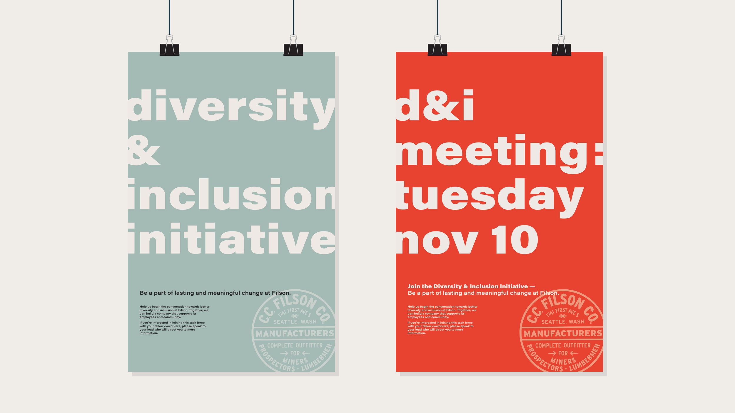
A set of posters and a calendar to be displayed throughout Filson's distribution warehouse and corporate offices. Intended to boost Filson's newly formed Diversity & Inclusion Initiative by introducing its existence and providing reminders for upcoming meetings. They are in four languages: English, Spanish, Chinese and Corporate (for the employees who have easy access to the information, but aren’t being active).
11" × 17"
Audience
Filson's warehouse and corporate employees
Goals
Raise awareness of Filson's D&I Initiative
Increase employee participation and involvement
Help create a more inclusive environment for Filson's Black and POC employees
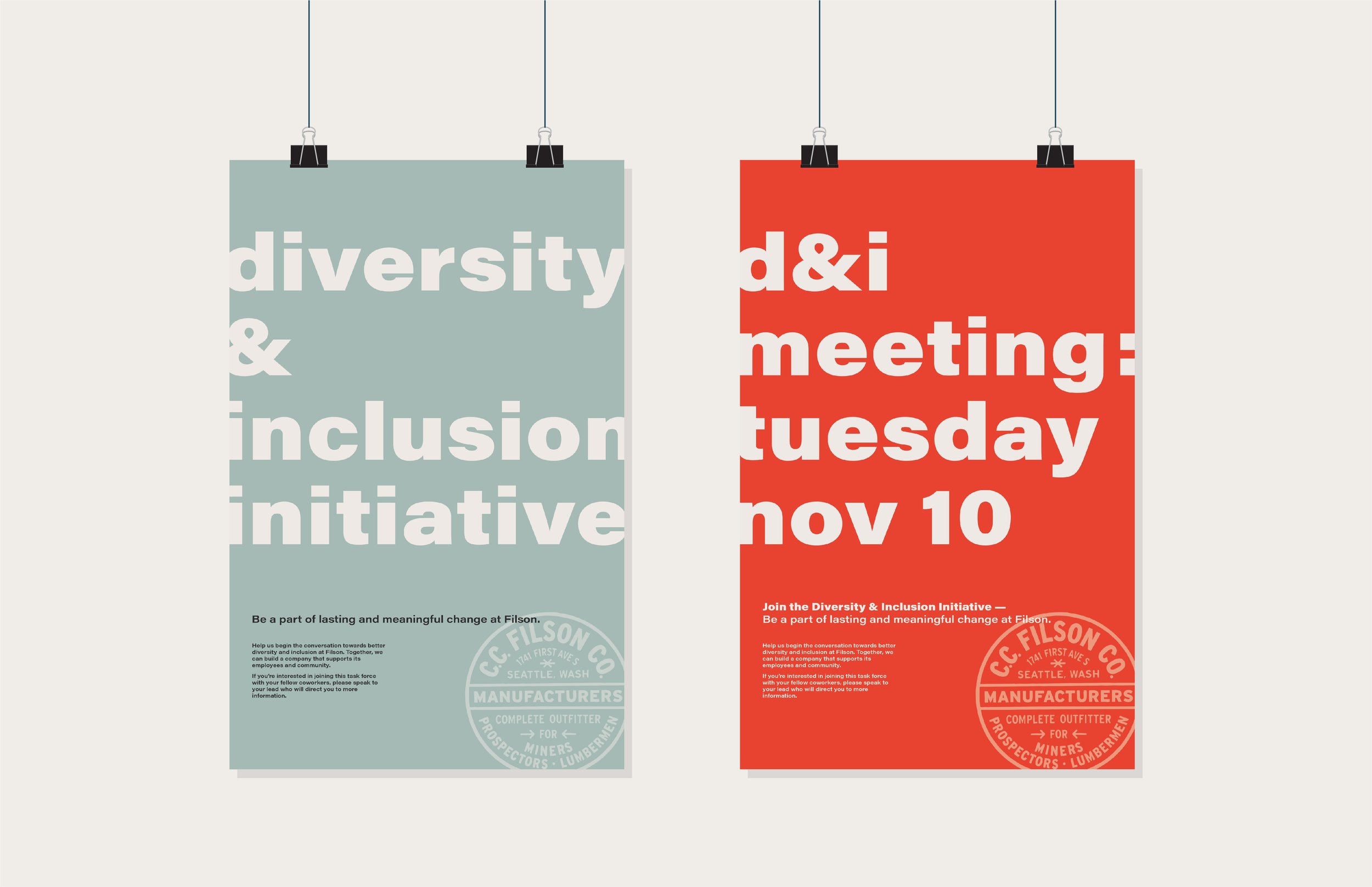

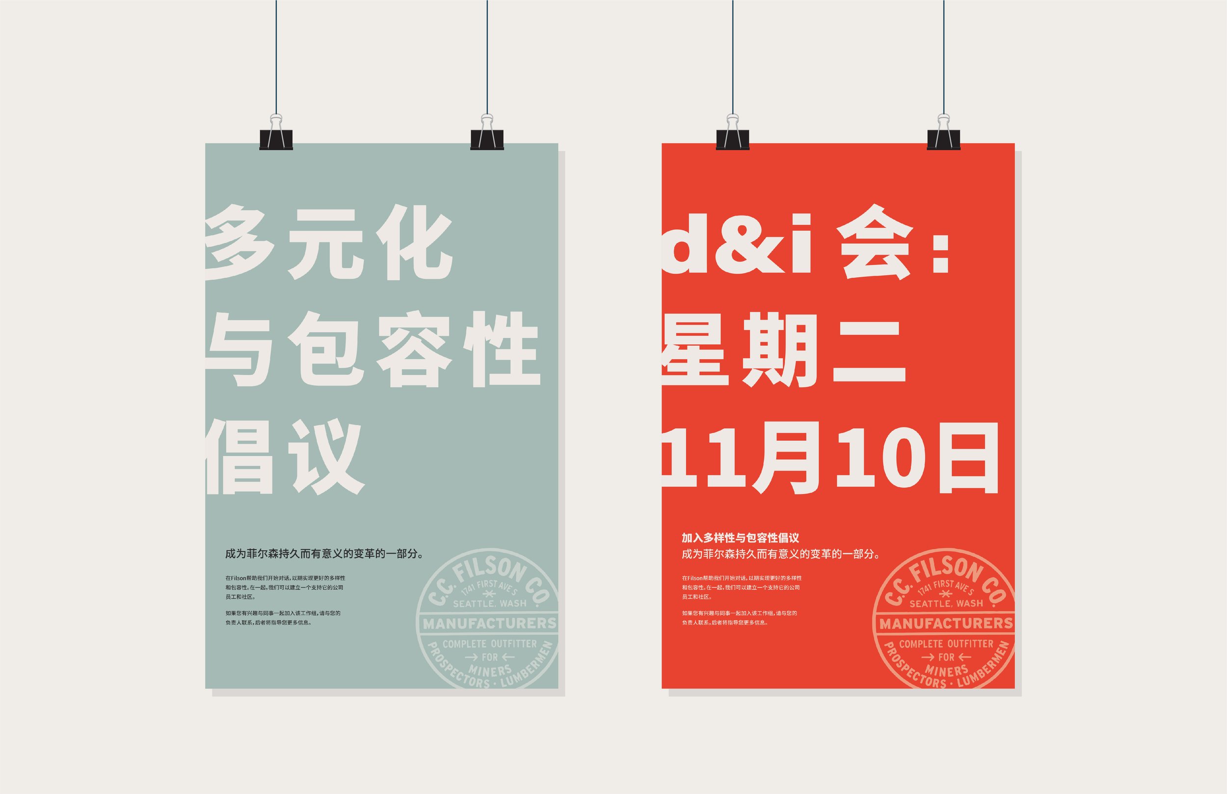

I began experimenting with poster layouts. Since warehouse workers are constantly moving and don't have a lot of free time during work hours, the posters needed to be eye-catching and straightforward. Acumin pro wide helps achieve this as a simple sans serif.
In order for the initiative's branding to still feel connected to Filson itself, I color sampled some of their products to generate a color palette. Since the warehouse and offices (where the posters would be displayed) are typically neutrals and earth tones, I eliminated the rugged tan, otter green and dark moss. I chose lake green and pheasant red because they would contrast not only with each other, but also against the environment of Filson's workspaces. The posters in lake green would be used to introduce the initiative, while the pheasant red is used for upcoming meetings — its brighter color provides a greater sense of urgency and stands out. For additional colors, I sampled a soft black and off white from Filson's website.


